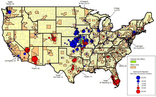
Income Migration by County 1994-2004
The map below shows the net “migration” of income. In other words the total income of those who moved to Kansas City minus the total income of those who left Kansas City.
The data yields a map very similar to the net migration map. This makes sense as the total income will be related to the total migrating population.
Differences
There are some significant differences however. The Los Angeles area for example is a large net in-migration metro for Kansas City. The net amount of income coming to the Kansas City area is much smaller. This would indicate that while far more people are moving from Los Angeles to Kansas City than the other way around, the incomes of the in- migrants must be less than the out-migrants. This is, in fact, the case as households that moved from Kansas City to Los Angeles had average annual incomes of $46,008 while those who moved to from Los Angeles to Kansas City had average incomes of $40,954.
Conversely, households moving from the Seattle-Tacoma, WA area had an average annual income of $96,346 while those moving to Seattle from Kansas City had $53,201 average.
Talent migration
In some cases one can look at the income migration as a measure of talent migration. When the incomes of new residents are high, one can assume it is because a local firm is paying a higher skilled employee. Using the above metros as examples, one could say that the Kansas City area is drawing more talent from Seattle than Seattle is drawing from Kansas City (Kansas City firms are paying higher wages to attract the talent). While Los Angeles firms are, on average paying migrants from Kansas City more than Kansas City firms are paying former Los Angeles residents.
The outflow of income to Florida and Arizona is also evident. These states have also have competitive metro areas vying for talented workers, but these states are also major retirement destinations and are no doubt attracting former Kansas City retirees.
Complete list of metros:
Click on the map for a larger PDF version of the image.